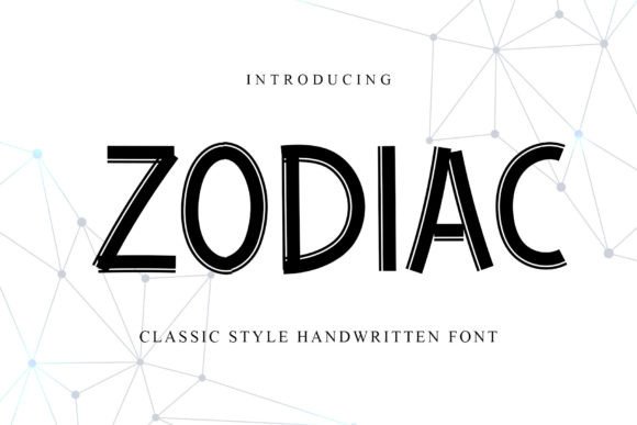
Zodiac: A Refined Script Font for Digital Branding
As a UI designer who ships dozens of landing pages, SaaS dashboards, and e-commerce experiences each year, I don’t reach for script fonts lightly. They’re high-risk, high-reward — one misstep in weight, spacing, or context and readability collapses. That’s why Zodiac stands out in my font library: it’s a carefully engineered script typeface that balances elegance with digital pragmatism. It’s not just “handwritten” — it’s intentionally paced, rhythmically balanced, and built to perform where users actually engage: on screens.
Zodiac belongs to the Script Amp category — meaning it’s designed as a display font first, optimized for impact at larger sizes without sacrificing legibility at medium weights. Its letterforms feature subtle tapering strokes, soft entry/exit terminals, and consistent x-height alignment — all of which translate well into responsive web layouts. Unlike many decorative scripts, Zodiac avoids excessive flourishes that blur on mobile or vanish at 24px on a retina display. Instead, it delivers warmth through controlled variation: gentle contrast between thick and thin strokes, open counters, and generous letter spacing that breathes in hero sections and navigation bars alike.
In practice, Zodiac excels where tone and trust converge. On a boutique skincare brand’s homepage, it transforms “Our Story” into an inviting, human-centered headline — instantly signaling craftsmanship and care. For a wedding planning SaaS, it elevates CTA buttons like “Book Your Consultation” without undermining urgency. And on a creative portfolio site, Zodiac used sparingly for section dividers (“Work”, “Process”, “Studio”) adds personality while keeping the interface scannable. It’s never the workhorse — but always the trusted accent.
Readability is non-negotiable, especially across devices. Zodiac performs reliably down to 28px on desktop headers and 24px on tablet hero text — provided you avoid tight tracking or low-contrast backgrounds. On mobile, I reserve it for top-level headings only (H1s and primary section titles), never body copy or form labels. For dark mode interfaces, I pair it with a light-weight sans serif and add subtle text-shadow (0 1px 2px rgba(0,0,0,0.15)) to maintain edge definition. Over image overlays, I always apply a semi-transparent background bar or use a soft stroke fallback via CSS text-stroke — never rely solely on contrast alone.
Visual hierarchy is where Zodiac shines most deliberately. Because it’s a single-weight script (with optional stylistic alternates), it forces intentionality: you can’t fall back on bold or italic variants to create emphasis. Instead, you lean into scale, color, and proximity. A Zodiac H1 at 48px paired with Inter Regular at 18px creates immediate distinction — no extra styling needed. In conversion-focused layouts, this clarity reduces cognitive load: users instantly recognize what’s primary, what’s supportive, and what’s actionable.
Font pairing is essential — and Zodiac thrives alongside purpose-built companions. My go-to pairing for modern digital brands is Inter or Manrope: neutral, highly legible, and engineered for screen rendering. For editorial or luxury-facing sites, I’ll pair Zodiac with a crisp serif like IBM Plex Serif or Charter — the contrast between organic flow and structured geometry reinforces brand sophistication. Avoid pairing Zodiac with other scripts or overly decorative sans serifs; it needs breathing room to retain its voice.
Zodiac works across a wide range of digital touchpoints — but context determines success. It’s ideal for:
- Landing page headers — especially for creative services, coaching, or artisanal products
- Logo lockups — when used as wordmark text (not monogram) and exported as vector assets
- Section dividers and subheadings — “How It Works”, “Testimonials”, “Join the Studio”
- Digital ad banners — at 32–40px, with ample padding and minimal surrounding text
- Course or ebook cover graphics — exported as SVG or high-res PNG for consistent rendering
- Branded email headers — embedded as web-safe fallback with graceful degradation
What’s not advisable? Using Zodiac for navigation menus, form fields, pricing tables, or any UI element requiring rapid scanning. It’s also unsuitable for long-form blog post titles unless tightly cropped and tested across iOS and Android browsers. And while Zodiac includes OpenType features like ligatures and swash alternates, I enable those selectively — only where they enhance, not distract.
From a technical standpoint, Zodiac ships as WOFF2 and WOFF for optimal web performance, with full Unicode support covering Latin Extended-A — enough for English, French, Spanish, German, and Polish markets. It doesn’t include variable axes, so plan your weight strategy early: one style, deployed with precision. No italics or condensed variants exist, which simplifies licensing but requires thoughtful layout planning.
Licensing matters — especially when shipping client work or selling digital templates. Zodiac is a commercial font, and its license covers web embedding via @font-face, app UIs, and digital ads — but not redistribution in editable design files (like Figma community templates) without extended rights. Always verify the license scope before bundling it into a theme, SaaS white-label kit, or Notion workspace template. When in doubt, purchase the desktop + web bundle — it covers most real-world scenarios designers face today.
In a landscape saturated with generic handwritten fonts, Zodiac earns its place by refusing to be background noise. It doesn’t shout — it leans in. It supports brand identity without overshadowing content. And for web designers who treat typography as infrastructure — not decoration — that balance isn’t rare. It’s essential.